Post
The New Erratic Wisdom
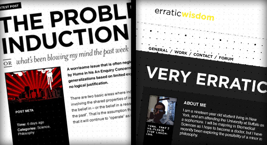
Another semester, another redesign (give it a solid refresh to clear your cache). This one’s been brewing for quite some time now, with the notched grid motif coming around a few months ago, along with my discovery of Gotham. It’s at once one of my most ambitious and most basic redesigns.
My intention was to create a more personal experience, to better illustrate myself through both the content and its presentation. Words aren’t the only, or even the best, way of portraying my thoughts anymore. So, alongside new posts you’ll find links to photographs I’ve taken and relevant songs I’m listening to. Visually, the clean lines and sharp (stiff, even) grid are me – I’m a neat freak.
I decided to hide away the sidebar after studying some ClickTales and even a few user surveys (thanks guys!). The sidebar is secondary content, supplementary information about me and what I’m doing, so it seems justifiable to push it aside to make room for the main content, while keeping it at your fingertips should you want to check on what I’m doing.
The site should work properly in all major browsers, although I am aware of a few remaining bugs and quirks. The redesign is so complex that I realized I would never get it live if I tried to squash every bug before launching.
There are also some improvements to the comment system which I’m sad to say I’ve neglected in the past few redesigns despite their key importance to the success of the site. In addition to giving you more room to type your responses, I’ve installed a plugin which allows you to quote other commenters by selecting the text you’d like to cite and clicking the “Quote” icon in the corresponding comment label.
The old version is archived here, and you can check out semi-complete archives of every redesign here.
Otherwise, peruse the site, check out the AJAX complements of jQuery and leave any feedback in the comments.
Update: I’ve attempted to correct some minor rendering issues with Safari. Please let me know if you encounter any other weirdness.

Archive
-
260.
The Ethics of Practicing Procedures on the Nearly Dead
The report from the field was not promising by any stretch, extensive trauma, and perhaps most importantly unknown “downtime” (referencing the period where the patient received no basic care like...
-
260.
The Ethics of Teaching Hospitals
I can’t imagine what the patient was thinking. Seeing my trembling hands approaching the lacerations on his face with a sharp needle. I tried to reassure him that I knew what I was doing, but the...
-
260.
Conscious Conversation: Behavioral Science
Dr. Eran Zaidel is a professor of Behavioral Neuroscience and faculty member at the Brain Research Institute at UCLA. His work focuses on hemispheric specialization and interhemispheric interaction...
-
260.
Progress Report
Two years down, I’m still going. The next two years are my clinical rotations, the actual hands-on training. It’s a scary prospect, responsibilities and such; but it’s equally exciting, after...
-
260.
Why Medical School Should Be Free
There’s a lot of really great doctors out there, but unfortunately, there’s also some bad ones. That’s a problem we don’t need to have, and I think it’s caused by some problems with the...
-
260.
The Cerebellum: a model for learning in the brain
I know, it’s been a while. Busy is no excuse though, as it is becoming clear that writing for erraticwisdom was an important part of exercising certain parts of my brain that I have neglected...
-
260.
Conscious Conversation: Philosophy
Daniel Black, author of Erectlocution, was kind enough to chat with me one day and we had a great discussion – have a listen.
-
260.
The Stuff in Between
I’m actually almost normal when not agonizing over robot production details, and quite a bit has happened since I last wrote an update. First, I’ve finally graduated. I had a bit of a...


Comments
I absolutely love it! Fantastic work, Tom.
The sidebar’s very cool btw, love the slide effect — Oh, and I see you’re on twitter too, following you now :)
Hamish M
Jan 21, 08:39 AM #
Seems like all the cool kids are going black, white and
redyellow all over :)Seriously man, love the redesign, especially what you’ve done with the archives on the bottom of the page. I might add though, while AJAX comments always seem like a sexy addition — they almost always provide frustration from the author’s point of view (to me, at least).
Kyle
Jan 21, 09:01 AM #
Thanks guys, for once, I too am loving this redesign. I usually don’t give the
same attention to my own blog as I do to other projects so it was really fun to pour myself into this one.
I actually didn’t know my comments were AJAXified. Are you talking about the contact form in the sidebar? I decided to make that one use AJAX because it might’ve been confusing for the user to have a page refresh when they’re in the pull-out sidebar.
Thame
Jan 21, 03:22 PM #
Tom: Clearly I needed more sleep when I wrote that :) “compliments” turned into “comments” in my head.
Kyle
Jan 22, 10:12 AM #
WHOA!! Brilliant!!
I’ve always found yellow difficult to work with and you’ve given it just the right amount of emphasis.
The grid layout is also fantastic, though it did take me about 20 seconds to find the comments link. That being said, the table of contents feel is slick.
You’ve definitely given me some ideas to consider when I get around to my own redesign. (I’ve been tossing around the idea of hiding the nav/sidebar as well)
I also had fun building my own dynamic headings:
http://erraticwisdom.com/assets/fonts/heading.php?conf=h3_latest_post&text=Penis%20Please tell me you’re planning a future post explaining how that works?
Scott Lenger
Jan 22, 11:47 AM #
Kyle:
Ahh, gotcha. I was wondering how I’d managed that without even knowing :)
I hope I restrained myself with the AJAX. I think the way it’s been used should make things easier, but I can see how users might just get annoyed.
Scott:
Yay, thanks! There’s alot of fun stuff behind the scenes so I may take another post to explain some of the details. In the meantime, I used this ALA article as a basis for the heading replacement.
Also, I hope you’re happy, but that image is now cached on my server :)
Thame
Jan 22, 04:12 PM #
Holy crap this is brilliant. The detail here is really amazing (I love how the grid is cut off at the edges).
The sidebar is amazing, the live archive thing is amazing. You’ve really got something special here!
Eric
Jan 23, 07:34 PM #
Looks beautiful… lovely work.
Jesse Bennett-Chamberlain
Jan 24, 07:03 AM #
Hot as sin dude. Nice work.
Justin Ruckman
Jan 24, 04:29 PM #
More thankyou’s to everyone!
Eric:
Nice, you caught alot of the stuff that I worked hard on. I appreciate it.
Jesse Bennett-Chamberlain:
Well, you’re just awesome. I can’t tell you how much that means!
Justin:
Yay, thanks. Nice logo work on your projects, BTW.
Thame
Jan 24, 05:38 PM #
Now, you know you’ve got tons going right on here. The other day, shortly before you unveiled this one, I went through your archives, design by design, and I had seen them all live, in their heyday. You brought in minimalism before it was the rage; you’re pushing what browsers can do; and, of course, the content is antithetical to the archetypical, vacuous “blahg.”
But…
But the grid behind the post text make it a little hard to read. Not by much, of course. But against a field of sans serif, set nice and small, even small grid points catch an ascender or a descender and confuse the eye a little.
That might be the intent. I’ll be the first to say I have plenty to learn about graphic design, and examples abound of good work that bucks any intention to be easy. But (a) it does distract a little, and (b) there’s so much deserved praise I thought a little constructive criticism would be a nice rhythmic change.
Grand work. Damn kids.
Daniel Black
Jan 24, 06:53 PM #
Also (procrastinating on homework), wonderful “+” grid corners in your matrix of previous entries.
Daniel Black
Jan 24, 09:41 PM #
Daniel:
Great call, I’ve bumped the background’s opacity up a bit. I can see how one of the large dots could pop in at the wrong place.
Thanks alot too for the kind words!
The “+” was luckily pretty easy. I jQuery’ed in the extra markup and just positioned the gifs at -3px around each item. They’re good dividers and are less harsh than borders.
Thame
Jan 25, 05:07 AM #
Looks similar to shauns site, an inspiration?
david
Jan 25, 12:16 PM #
david:
Not really, though I’ve always loved Shaun’s style. Perhaps si8 for the concept of hiding some of the navigation. All I really see similar is that there’s some kind of grid background on the page and mine works a bit differently.
Thame
Jan 25, 12:47 PM #
This is absolutely brilliant. I too have been watching your various redesigns and this is by far my favorite. It’s obvious that you’ve spent alot of time on this.
It’s a beauty!
Eric
Jan 25, 06:29 PM #
heh, this will take some getting used to, my eyes aren’t as young as they used to be.
david
Jan 26, 01:40 AM #
Eric:
Thanks! It did take me a long time, but that only made launching it even sweeter.
Thame
Jan 26, 08:27 AM #
Oh yeah, this works. Great work Tom.
Nice to see you’re sticking with TXP too.
Mat
Jan 26, 11:27 AM #
it is interesting that you put your design history in one archive page. clever!
daustralala
Jan 26, 10:57 PM #
Absolutely fucking beautiful, excuse my French. Great job!
Milo
Jan 28, 09:02 PM #
This is a really radical change but I’m loving it! Congratulations on taking a bold risk with successful results :)
beth
Jan 29, 09:25 AM #
Mat: Thanks. Textpattern made it easy, as always.
daustralala: Some of the earlier versions are unfortunately incomplete, but I’ve made it a habit to keep full archives since about v7.
Milo & beth: Yay, thanks!
Thame
Jan 29, 04:20 PM #
Black and yellow, baby. That’s where it’s at these days! I just launched my new blog last week. Want to guess the colour scheme?
Seriously, though. Great work. I really like it.
Eoghan McCabe
Feb 4, 10:58 AM #
Thanks Eoghan, you know what they say about great minds right, they pick similar color schemes.
I came across your redesign recently and really love it, nice job!
Thame
Feb 4, 11:52 AM #
This new design is brilliant! I like the use of AJAX for the sidebar, though I have to admit I didn’t notice it until I read the article. I will have to wait until another time to try out the quoting of messages. :)
Tom Martin
Feb 4, 04:39 PM #
Hey Man,
Nice work, great design. You have a great eye for type and composition. And your palette choices are great too.
Quick one for you, are you affiliated with Design Taxi? Your favicons are almost identical. And your palette. Just curious.
http://www.designtaxi.com/
Devin
Feb 9, 10:35 AM #
This design is so good that I just enjoyed every single pixel of it!
Keep up the good work!!
Roman
Feb 9, 12:05 PM #
Thanks Tom!
Devin:
No, our favicons are awfully similar though (I actually prefer theirs).
Roman:
Thanks, I ached over every pixel so I’m happy you’re enjoying it!
Thame
Feb 10, 05:53 PM #
I truly love the design and the erratic wisdom is excellent…
Judas
Feb 16, 02:24 PM #
Interesting approach. Best of luck!
baron
Feb 19, 06:54 AM #
one of the most beautifull blog design i’ve ever seen! really!
eduardo
Nov 25, 09:51 AM #
Add a Comment
Phrase modifiers:
_emphasis_
*strong*
__italic__
**bold**
??citation??
-
deleted text-@code@Block modifiers:
bq. Blockquote
p. Paragraph
Links:
"linktext":http://example.com