Post
CSS Printing Guide
When working at a university setting, many of the relatively minor aspects of web design come to the forefront due to legal accessibility requirements. One of the most prominent such requirement is for effective printing.
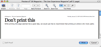
Many websites such as uxmag and A List Apart use print stylesheets that produce a bare-bones version which, though easy to read, can be confusing. One particularly good example of this confusion is found when printing the uxmag home page.

How confusing is that going to be to an average user? While the message suggests that not printing the home page was just a recommendation, it becomes obvious after a few minutes of scanning that it is impossible to print the home page content without resorting to a more primitive “Print Screen” or other obscure method.
Also, some research done by others at my workplace has suggested that a typical user expects to print out a replica of what they saw on screen, and such drastic transformations as those found on the previously mentioned websites are very disconcerting and often make the user think that they have printed out the wrong page.
What is the solution?
Until printing background images and colors becomes more common (or at least a more easily accessible setting instead of the currently obscure checkboxes placed eight levels deep into preference panes), the best way to preserve a website’s appearance during printing is to include hidden, print-only images and restructure the printed page to fit a paper’s restrictions. You can also modify other things to make the printed page easier to read; bumping up the font size or changing the body text to a serif typeface can have huge impacts on readability.
The advantages of this approach over the more drastic revisions is that it:
- Maintains the website’s brand by allowing for the inclusion of logos, etc.
- Preserves the website’s appearance and ensures that the printed product is recognizable.
- Instantly doubles your perceived attractiveness by the opposite sex.
Let’s get started
First things first, since most browsers don’t print out background images or colors, make sure to force them off in your print stylesheet. I’m not usually a fan of “! important” rules that override the user’s defaults, but preparing a print stylesheet for no backgrounds and then printing with backgrounds can make a huge mess.
/* Print Overrides
----------------------------------------------- */
* {
	background: none ! important;
	color: #111 ! important;
}
Another thing I do is create a “print” class which I can apply to any elements that I want to be hidden on screen but visible when printed. So just add a “display: none” rule in your screen media stylesheet and bring them back with a “display: block” or “display: inline” where necessary in the print stylesheet.
The next thing to do is decide what elements you need to preserve and what elements don’t make much sense to be printed. For example, you can usually forgo search and login boxes, and extraneous content modules. They’re not going to be used on a piece of paper and usually aren’t major contributors to a website’s distinct appearance. Knock these of with an opposite to the previously mentioned “print” class. Something like “screen” or “print_off” is usually understandable. Just add a “display: none” rule in your print stylesheet to get this working.
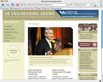
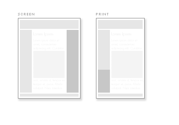
The addition of global and site-wide logos is next. I usually have these titles in headline elements to which I can then add the hidden “img” tag. Again, try to preserve the website’s brand as well as you can with these replacement images. For example, the UB Engineering Newsletter has a very unique header which helps show the mini-site’s relationship to the main Engineering website.
On Screen Header

Print Header
![]()
Next are the structural changes. While IE7’s printing capabilities have increased significantly, the still popular IE6 sucks major printed ass. One especially frustrating limitation is on the page width which, at the default margin settings, cannot exceed a slim 605 pixels at a penalty of having anything past that limit cut off entirely.
While this is annoying, it is usually not too hard to bring two-column layouts in line by simply shrinking each column until it fits. The real trouble comes with three-column layouts where shrinking each column would render them all almost unreadable and would break the layout on pages that include large images or other wide, fixed-width elements. A cool trick I’ve found is to drop the third column in after the first in the print stylesheet. By clearing the rightmost column and floating it to the left, you can actually condense a three-column layout into two and finally fit everything on the page.

Here’s an example:
#page {
	width: 605px;
}
	.column {}
		.column.one {
			float: left;
		}
		.column.main {
			float: right;
		}
		.column.three {
			clear: left;
			float: left;
		}
Finally, it is important that your website’s structure not be lost. Like many, I use the faux columns to get the appearance of equal height floated columns. However, this means that your columns will have no distinct separators when printed. Adding a 1 pixel light grey border to your columns can make the page more readable and can also be used to call out items that were featured on screen.
Those are all the tips I have for now. Hopefully they will help make your site print more effectively. If you have any tips or suggestions, please leave a comment and I’ll be sure to add them to the article.
Related Reading
Archive
-
260.
The Ethics of Practicing Procedures on the Nearly Dead
The report from the field was not promising by any stretch, extensive trauma, and perhaps most importantly unknown “downtime” (referencing the period where the patient received no basic care like...
-
260.
The Ethics of Teaching Hospitals
I can’t imagine what the patient was thinking. Seeing my trembling hands approaching the lacerations on his face with a sharp needle. I tried to reassure him that I knew what I was doing, but the...
-
260.
Conscious Conversation: Behavioral Science
Dr. Eran Zaidel is a professor of Behavioral Neuroscience and faculty member at the Brain Research Institute at UCLA. His work focuses on hemispheric specialization and interhemispheric interaction...
-
260.
Progress Report
Two years down, I’m still going. The next two years are my clinical rotations, the actual hands-on training. It’s a scary prospect, responsibilities and such; but it’s equally exciting, after...
-
260.
Why Medical School Should Be Free
There’s a lot of really great doctors out there, but unfortunately, there’s also some bad ones. That’s a problem we don’t need to have, and I think it’s caused by some problems with the...
-
260.
The Cerebellum: a model for learning in the brain
I know, it’s been a while. Busy is no excuse though, as it is becoming clear that writing for erraticwisdom was an important part of exercising certain parts of my brain that I have neglected...
-
260.
Conscious Conversation: Philosophy
Daniel Black, author of Erectlocution, was kind enough to chat with me one day and we had a great discussion – have a listen.
-
260.
The Stuff in Between
I’m actually almost normal when not agonizing over robot production details, and quite a bit has happened since I last wrote an update. First, I’ve finally graduated. I had a bit of a...


Comments
very nice article !
thx for sharing
qureyoon
Jan 22, 08:04 PM #
ironically, when i print out this article, i get a really ugly layout, not unlike the one on Wired.com.
sean
Jan 23, 05:57 AM #
Instead of using px for sizing use pt and in (inches). I usually change all text sizes from px to pt and change widths of divs, etc to size using ‘in’ (inches).
px measurements are much smaller than their pt counterparts.
DRoss
Jan 23, 08:01 AM #
But I want to be more attractive to members of the same sex.
Jeff
Jan 23, 08:06 AM #
use elements (em) instead of pixels
em
Jan 23, 08:36 AM #
Nice article, enjoyed it!
I had one question/suggestion: If print-only elements are hidden in the screen stylesheet, do you think this will affect things such as screen-readers, or when a user views the page with no style?
My own opinion: I haven’t tried it, but I think it would be ok with images defined in the CSS code, but hidden text would cause confusion. (e.g. something like ‘This is the print version of example.org’ and being set to hidden on the screen stylesheet)
Hyperreality
Jan 23, 09:03 AM #
I have to say that I don’t agree with the article at all. In past experience, we have found that the user does not want to print what they see on the screen, but print the content. Why waste the ink to print images, useless navigation and things like that.
I am interested in the research that you were talking about. Is there a page where I can read the results of the research?
Jamie Likely
Jan 23, 09:15 AM #
In most cases you don’t need to create a new ‘print’ class for stuff you want to suppress on paper – you probably already have a navbar class or adverts class which can be set to not display in the print stylesheet. In many cases an additional ‘print’ wrapper isn’t necessary and imposes additional work on the HTML which could be a major burden, depending on how your site is structured.
Sean McManus
Jan 23, 09:24 AM #
hi, loving this article. When I do print styles I like to use at the top:
div { display:none;}
and then I can work my way through the divs I want showing step by step e.g.
#MainContent { display:block; float:left;}
Clean and commented code makes for easy progress :)
nice one
Skuff
Jan 23, 09:41 AM #
that is a good one thanks!!
nick99
Jan 23, 10:16 AM #
I agree with the poster Jamie in that most people actually want to strip all of that stuff out and keep the content….and as someone who has to manage a University computer lab, I wish that sites were always written so that you could just print the text. I generally make repeat offenders copy and paste into Word and then clean out what they don’t want.
John
http://www.monomachines.com
John
Jan 23, 10:18 AM #
I take issue with the statement “Instantly doubles your perceived attractiveness by the opposite sex. “ That is a narrow-minded and excluding view of society.
Kevin Burke
Jan 23, 10:42 AM #
Thank you for this article. I look forward to applying these techniques.
James Carlos
Jan 23, 10:45 AM #
Thanks! Thanks! Thanks!
yakito
Jan 23, 12:40 PM #
OMG YOU’RE SO SMART!!!
thecrunkmeister
Jan 23, 02:56 PM #
I can’t make up my mind if I agree with this article or not.
On one hand I completely agree that you have to maintain branding on a printed document (I work at a design firm, so this is doubly important).
On the other, i’m completely against the idea of print/screen specific classes, it’s completely redundant when you have media specific style sheets.
As far as extra print only images go, we sometimes need to use a hidden print logo (that also acts as a non-css logo) when the design doesnt contain a print friendly logo, but avoid any others.
One final note, I believe there are some issues with floats and printing in firefox, and them not continuing on to a second page, this may muck up your columns, although i’m not sure if it’s still an issue.
Either way, it’s interesting to see some discussion on the matter.
David Singleton
Jan 23, 03:22 PM #
Thanks for all the great feedback everyone. I understand that this approach is somewhat controversial, but I believe that it is in the users’ best interests.
sean:
You’re right, I actually didn’t make a print stylesheet for this website. Luckily, it degrades pretty well and is functional at least.
jeff and Kevin Burke:
That was a joke people. Sorry I may have offended you, but seriously…joke.
Hyperreality:
Good point, most text-to-speech applications (correctly, I believe) do not read elements with “display: none”, which causes some problems with a few image replacement techniques but actually works in our favor here.
Jamie Likely:
I’ll see if I can get a hold of the results. I wasn’t involved in the research at all, but everyone seemed convinced (and I agree, obviously), that the user would have a more fluid experience if there was at least an attempt to maintain the website’s visual style while printing.
Sean McManus:
Good point, although I don’t typically create a wrapper “print” division, it’s quite a bit cleaner to just add it as a class on the existing element.
John:
I understand. A happy medium might be to include a “Print this article” link where applicable and send the user to what would be printed similar to what was described in this article.
That way, the user could have a look at what they were going to print first and you could even have a regular print stylesheet to catch those who printed right from the menu.
David Singleton:
Adding the print classes are certainly not a requirement. You can instead list each element you want to show or hide directly. I just found that it does provide some semantic value and also makes it easier to quickly apply the rule and keeps the css clean.
Thame
Jan 23, 08:14 PM #
Some nice ideas there. Thank you.
I already use the “print” class, but had not thought of using it with specially prepared images. Nice one.
A word of caution – I have found floats are treated rather badly on printing. Floated images are likely to appear split across two pages, for example. I suggest doing as much as possible with a static layout. Then there’s the Firefox issue that David Singleton mentioned.
Another thing to avoid is justified text. This usually comes out as plain ugly. Oddly, given IE’s generally poor rendering engine, that browser’s proprietary “text-justify: newspaper;” does a tolerable job of justification. (!?)
David Hucklesby
Jan 23, 09:15 PM #
An additional benefit to using a different logo for the print version is that you can use a larger graphic and then scale it down in the CSS. The image in the final printed document then looks better, as the printed image ends up being higher resolution.
Mediaman
Jan 24, 08:27 AM #
Something else I’ve found to be invaluable is Firefox’s File->Print Preview function. Try it out – it’s awesome (and saves lots of paper and ink).
Nathan Logan
Jan 24, 12:26 PM #
Interesting take, thanks for writing it up.
Does this technique actually reduce attractiveness to the same sex? I need to know what I’m getting into here (or perhaps not getting into, depending).
What a pain this is, but hey – better than PDF, IMHO.
Oh BTW in FF/OS X 10.4.8, I’m not getting any action from the font-size buttons (which I really like BTW, much better than a series of A’s)
Peter Jacobson
Feb 13, 09:24 PM #
Peter:
Thanks,
Don’t worry, clearly any geek-like activity like print stylesheets will vastly increase your attractiveness.
And, what version of FF are you using? It’s looking OK in 2 and 1.5 over here…
Thame
Feb 14, 06:20 PM #
that is a good thanks!
phen0m
Mar 4, 05:20 PM #
Thank you for the great article. Greetings from Germany.
Andreas
Mar 9, 12:55 AM #
Hiya,
I just posted a blog entry about how to keep CSS really simple.
I hope you can let me know whether you think it is dreadful/delighful.
http://jonwinstanley.blogspot.com/2007/04/reduce-frustration-of-css.html
Thanks!
Jon
Jon
Apr 17, 02:28 PM #
How can remove Header and footer message through coding, usually it can be handled by print property which depends system to system, but i want set header as null or customized message for all systems.
Upenra
Apr 23, 07:45 AM #
Thank you for the great article. It’s amazing what you can do with CSS!
Mark Dog Breed
May 22, 03:41 PM #
What happened to the images in this post? None of them are displaying.
paul
Jul 16, 02:37 PM #
Oopsy. Thanks for the heads-up.
Thame
Jul 16, 04:22 PM #
Greasemonkey it! User experience is everything? Yeah, right.
// ==UserScript==
// @name fix_print
// @namespace any
// @description remove the print stylesheet
// @include www.uxmag.com
// ==/UserScript==
(function(){ var links = document.getElementsByTagName(‘link’); for (i=0; i
EA
Oct 13, 11:26 PM #
Hi every body:
i have a problem in printing the background of my application.
Is the problem is in the CSS or ?
thanks..
Mousa Sami Shamieh
Feb 21, 11:23 PM #
Hi mousa,
No you cannot print the background :(
Issa
Dec 23, 02:06 AM #
Add a Comment
Phrase modifiers:
_emphasis_
*strong*
__italic__
**bold**
??citation??
-
deleted text-@code@Block modifiers:
bq. Blockquote
p. Paragraph
Links:
"linktext":http://example.com